


For entrepreneurs looking to grow their business to a million dollar year, multi-million, and even a billion-dollar-business, understanding the impact of website design on conversions is crucial. It’s a common misconception that fancy design automatically translates to higher conversion rates. In reality, the key to turning visitors into buyers lies in striking the right balance between aesthetics and functionality.
There are a few things that I always recommend to prospects when discussing their website build. First, there is so much functionality that you can add to your website (and usually fairly easily) that not only helps your customers and prospects (important!) but can also help you and serve almost like an extra member of your team by automating some of your work.
I also always remind clients that their website doesn’t need to look super fancy, or have the most beautiful design in the world, to attract visitors and create customers. (In fact, something too fancy may end up distracting from the sale if a visitor spends more time looking at the design than getting the job done.) Shiny object syndrome!
Yet I also remind clients there are some very basic design requirements that are critical for helping keep your audience on your site longer (including website design mistakes to avoid) and helping more of them convert into paying customers. Finding that right balance is what’s important.
In this article, we’ll discuss the various aspects of website design and their impact on conversions, helping you determine when additional design elements matter and when they don’t.
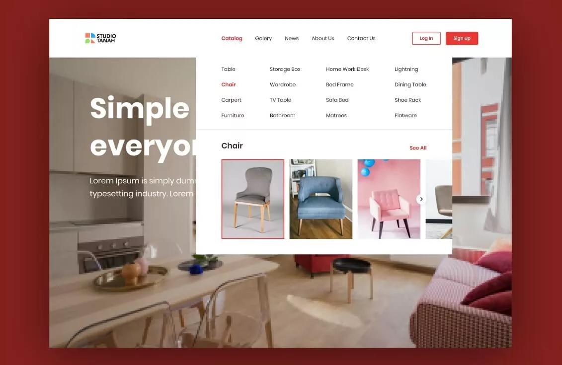 A website’s navigation plays a vital role in the user experience. A clean, straightforward, and easily accessible menu allows users to find the information they’re looking for with minimal effort.
Overcomplicating navigation with fancy design elements may confuse or frustrate visitors, leading to lower conversion rates.
Prioritize clear, user-friendly navigation to keep your audience engaged and guide them towards the desired action.
Imagine visiting an online clothing store with a poorly designed navigation menu. The main menu includes vague categories like “Shop,” “Products,” and “New Arrivals,” each with a disorganized dropdown list.
Items are grouped haphazardly, with unrelated products mixed together, making it difficult to locate specific items. Some subcategories lead to broken links or outdated pages, and there is no clear indication of the website’s sales or promotions.
Frustrated by the confusing navigation, visitors may struggle to find the items they’re looking for, leading to a poor user experience. As a result, potential customers may abandon the site without making a purchase, resulting in lost sales and decreased conversion rates. The chaotic design may also damage the brand’s reputation, causing users to associate the company with disorganization and unprofessionalism.
Now, envision an online clothing store with an intuitive navigation menu.
The main menu contains well-defined categories like “Men,” “Women,” and “Kids,” each with a neatly organized dropdown list. Items are grouped logically by type, such as “Shirts,” “Pants,” and “Accessories,” making it easy for users to find what they need. The website also features a prominently displayed “Sale” section and a search bar for quick product access.
With clear, easy-to-use navigation, visitors can effortlessly browse the site and locate desired items, creating a seamless user experience. This user-friendly design encourages potential customers to explore the website, increasing the likelihood of making a purchase and boosting conversion rates.
Furthermore, the organized and professional appearance of the site enhances the brand’s reputation, fostering trust among visitors and promoting customer loyalty.
Legible, well-structured content is essential for retaining the attention of your audience. Fancy fonts and excessive design elements can distract from your message and make it difficult for users to absorb crucial information. Choose clean, easily-readable fonts and maintain a balance between text and white space to ensure your content is both visually appealing and accessible.
 Imagine visiting a blog that covers various topics, from technology to lifestyle. The site’s design is chaotic, featuring multiple competing background patterns, a hodgepodge of font styles, and inconsistent font sizes.
The text is cramped, with minimal white space, making it difficult for users to focus on the content.
Additionally, the blog uses low-contrast color combinations, making the text hard to read against the background.
The overwhelming design and poor typography choices make it challenging for users to engage with the content, causing them to leave the site prematurely. This leads to increased bounce rates, reduced user engagement, and lower overall site performance. Additionally, visitors may associate the blog with unprofessionalism and disorganization, impacting the site’s credibility and reputation.
Now, envision a blog with a design that prioritizes readability. The site features a clean, well-organized layout with ample white space, making it easy for users to focus on the content. It uses a limited number of legible fonts with consistent sizing, and a high-contrast color scheme ensures that the text is easily readable against the background.
With improved readability, users can comfortably engage with the content, resulting in increased user satisfaction and longer session durations. This contributes to better user engagement, potentially leading to higher conversion rates, such as newsletter sign-ups or product purchases.
The clean, professional design also enhances the site’s credibility, encouraging users to return for future visits and building trust with the audience.
Design to Optimize for Mobile Devices
With the majority of users accessing websites from mobile devices, a responsive design that automatically adjusts to various screen sizes is crucial. A website that doesn’t perform well on mobile devices may turn away potential customers, leading to missed conversion opportunities. Focus on creating a seamless browsing experience for all users, regardless of the device they’re using.
Imagine visiting a local restaurant’s website on your smartphone to check their menu and location. The site features a fixed layout designed for desktop screens, making it difficult to navigate on your mobile device.
Text and images appear tiny, forcing you to zoom in and out to read the content or click on links. The site’s navigation menu is not mobile-friendly, with small, closely spaced buttons that are difficult to tap accurately.
The non-optimized design creates a frustrating and inconvenient user experience for mobile visitors. Potential customers may leave the site without finding the information they need, resulting in lost business opportunities and decreased conversion rates. Additionally, poor mobile performance may harm the restaurant’s online reputation, as users may associate the brand with an outdated or unprofessional online presence.
 Now, envision a local restaurant’s website with a design optimized for mobile devices.
The site features a responsive layout that automatically adjusts to various screen sizes, providing a seamless browsing experience across different devices.
Text and images are easily readable, and the navigation menu is transformed into a mobile-friendly, collapsible hamburger menu with adequately sized tap targets.
With a mobile-optimized design, users can effortlessly access the information they need, resulting in a satisfying user experience. This increases the likelihood of potential customers visiting the restaurant, boosting conversion rates and business success. A smooth and professional mobile experience also enhances the restaurant’s online reputation, conveying a modern and customer-centric brand image that fosters trust and loyalty.
 Excessive design elements can slow down your website, negatively impacting user experience and conversion rates.
A slow-loading website may cause visitors to abandon your site before they’ve had a chance to engage with your content. Optimize images, reduce heavy scripts, and leverage browser caching to ensure a fast and smooth browsing experience.
Picture an online art gallery website that aims to showcase its pieces in the highest possible quality. The site is packed with large, high-resolution images and features complex animations and scripts, such as parallax scrolling and auto-playing background videos.
While these elements may appear visually impressive, they significantly increase the site’s loading time.
As a result of the slow loading times, users may become frustrated and impatient, opting to leave the site before fully exploring its content. This leads to increased bounce rates, reduced user engagement, and lower conversion rates. Additionally, slow-loading websites may suffer from reduced visibility in search engine rankings, further impacting the site’s overall performance and reach.
Now, consider an online art gallery website that has optimized its design for fast loading times. The site uses compressed, appropriately-sized images, ensuring they maintain an adequate level of quality without affecting page load times.
The site also employs lightweight scripts and minimizes the use of complex animations, focusing on a smooth and efficient browsing experience.
Remember, computer screens can’t display more than 72dpi (PC) or 96dpi (Mac) anyway, so loading in an image that is 300dpi or 600dpi is simply overkill for the majority of website usage.
By optimizing the design for fast loading times, users can quickly navigate the site and enjoy its content without facing any delays. This results in improved user engagement, decreased bounce rates, and increased conversion rates. Furthermore, a faster-loading website may also benefit from better search engine rankings, making it more visible to potential customers and enhancing the overall success of the site.
While an overly fancy design may not contribute to increased conversions, it is still important to maintain a professional appearance. A polished, well-designed website instills trust in your brand, making users more likely to engage with your products or services. Focus on clean design, high-quality images, and consistent branding to create a trustworthy online presence.
Imagine visiting a consulting firm’s website seeking professional advice. Upon entering the site, you notice inconsistent branding, with multiple competing color schemes and logo variations used throughout. The layout appears cluttered, with an overuse of different fonts and mismatched stock images. Text is riddled with spelling errors and grammatical mistakes, further diminishing the site’s credibility.
The unprofessional design gives potential clients the impression that the consulting firm is disorganized and lacks attention to detail. This erodes trust and confidence in the firm’s ability to provide reliable advice or services.
Consequently, users may be reluctant to engage with the company, leading to missed business opportunities and a diminished reputation in the industry.
 Now, envision a consulting firm’s website with a polished, professional design. The site features a consistent color scheme and a well-designed logo that is prominently displayed on every page.
The layout is clean and organized, using a limited number of fonts and quality, relevant images.
The content is well-written, informative, and free of spelling and grammatical errors.
The professional design instills trust and confidence in the consulting firm’s expertise and capabilities. Potential clients are more likely to engage with the company and seek its services, resulting in increased conversion rates and a growing client base. Furthermore, the firm’s professional image enhances its reputation in the industry, setting it apart from competitors and contributing to long-term success.
A well-designed call-to-action (CTA) can significantly impact conversion rates. Avoid using excessive design elements that may overshadow or distract from your CTAs. Instead, use contrasting colors, clear text, and strategic placement to guide users towards taking the desired action.
Imagine an online subscription service website offering curated monthly boxes. The site has a visually appealing design, but its calls-to-action (CTAs) are either ambiguous or hard to find (or non-existant).
The CTAs use vague language like “Learn More” or “Get Started” and are buried within large blocks of text or overshadowed by distracting design elements. Consequently, users struggle to identify the primary action they should take on the site.
Ineffective CTAs make it difficult for users to understand the desired action, leading to confusion and a poor user experience. They don’t know what to click, or why, or how to continue their journey.
As a result, potential customers may not subscribe to the service, causing missed revenue opportunities and decreased conversion rates. The lack of clear direction may also lead users to question the site’s credibility and professionalism.
Now, envision an online subscription service website with clear and effective CTAs. The CTAs use concise, action-oriented language like “Subscribe Now” or “Claim Your First Box,” making it easy for users to understand the primary action. They are prominently displayed, using contrasting colors and strategic placement, such as above the fold and near relevant product descriptions, to catch users’ attention.
With clear, well-placed CTAs, users can easily identify the desired action, resulting in a more streamlined user experience. This encourages potential customers to subscribe to the service, increasing conversion rates and boosting revenue.
The straightforward messaging and polished design also enhance the site’s credibility and trustworthiness, contributing to the brand’s overall success.
While the majority of business will not need fancy bells and whistles and shiny objects for their design, there are a few instances in which having a higher-end design aesthetic – which comes with a much higher pricetag – can benefit some businesses in a handful of industries.
Here’s example of a couple of business types that can benefit from having a stronger focus directly on the design component of their website first.
Luxury brands, such as high-end fashion houses, jewelry companies, or upscale automobile manufacturers, can significantly benefit from a polished, fancy design. Their target audience expects an elevated level of sophistication, and a luxurious website design can reflect the exclusivity and premium quality of their products.
For example, a high-end fashion brand may invest in a visually stunning website with immersive, full-screen imagery, elegant typography, and seamless animations. This luxurious design experience reinforces the brand’s identity and justifies the premium pricing of its products.
Benefit: A fancy design can enhance the perceived value and prestige of luxury products, helping justify higher price points, and attracting affluent customers who expect an elevated user experience.
Professional photographers can also greatly benefit from a high-end, polished website design. As visual artists, photographers need to showcase their work effectively, and a visually stunning website can serve as a compelling portfolio that highlights their expertise and creativity.
For example, a photographer may invest in a website with a sleek, full-screen gallery, showcasing their images in high resolution, along with smooth transitions and minimalistic design elements. The website may also include a unique, visually appealing way of navigating between different photography categories or projects, offering visitors an engaging, immersive experience.
Benefit: A high-end design not only enhances the photographer’s online presence but also helps potential clients appreciate the quality of their work. A visually impressive website can attract high-value clients who are willing to invest in top-tier photography services, ultimately contributing to the photographer’s reputation and success in a competitive industry.
The key to unlocking the full potential of website design for conversions lies in striking the right balance between form and function. Prioritize user experience, mobile optimization, and a professional look while avoiding unnecessary design elements that may hinder your conversion goals. By focusing on the aspects of design that truly matter, you can create an engaging and effective website that drives growth and success for your business.

Vicky is the CEO and Chief Creative Strategist of Vicky Wu Marketing. She draws from 30 years of experience at the CMO level, the CEO level, marketing for Fortune 500 companies and multi-million and multi-billion-dollar organizations, PLUS strategies learned helping startups and nonprofits with limited budgets … now focusing on providing SMBs with effective and efficient marketing strategies – giving them access to the same level of expertise as the really big guys with deep pockets, that they may not otherwise be able to access.