Answering entrepreneurs' most burning marketing questions
Pull up a chair, grab a cup of coffee, and get quick, targeted marketing advice
Our CEO Vicky Wu brings her 30 years of experience marketing for Fortune 500 companies, multi-million and multi-billion-dollar global corporations to answer your specific marketing questions. Most entrepreneurs aren’t able to find – or afford – access to this level of expertise. And that’s exactly why we’re bringing it to you.

Entrepreneur Question:
I'm paying a friend to make my logo. Is having a cheap or free logo okay for my business?
Brenda
Expert Answer:
This is a loaded question that the answer is yes, no, maybe, depends. Which will make my answer long…
Like I always say – start where you start. This may mean that you initially have a free or very cheap logo, either that you make yourself, a friend makes, or you hire one of the cheapest options off Fiverr.
BUT … the answer is mostly no if you’re wanting to grow to 7-figures and beyond.
Over the years I see that every business runs into issues with these free/cheap logos and at that point has to pay to have them redesigned. That’s where the problem comes in. You’re paying more, and the look may change and that lack of consistency can have a negative impact.
I say if you are going to pay any amount now, then you should pay a bit more for a logo designed by a professional, so that you won’t have to pay again later. (And, let’s not forget, with inflation, it will also cost more later.)
I’ve been designing logos for decades and working with businesses that want to grow significantly … and for those businesses the free and cheap logos don’t work long-term.
Your logo is, hands down, THE most recognizable piece of your brand (although branding goes well beyond just your logo). And as such, it’s not the place for you to skimp. It’s worth more than you realize (money, time, headaches) to use a professional.
And by professional I don’t mean someone who dabbles in making designs in Canva or a similar platform and gets paid to do it. f this level of logo is what you’re getting, then it’s actually better to do it yourself, and save what you would have paid for when you can afford a professional redesign. Otherwise you WILL end up paying twice – maybe more since the redesign may also require a full rebranding of your online presence (which costs a LOT more). If you think about all the places you would need to update your logo after even just a couple of years using it, when you hit the wall at which that old cheap one won’t work any more, keep in mind that rebrands can run thousands of dollars simply because of the amount of work involved.
A professional logo designer knows some basic, critical things that your logo requires for commercial use:
- The psychology behind colors, and if the ones you are choosing are saying the right thing about your business
- The requirements of commercial printers – these often need a vector file in cmyk – and the cheap vendors off Fiverr or a design made in Canva don’t meet these requirements. We’re not talking printing at Kinko’s, or the printing that Canva can do for you, but when you have to go to a higher level of printer – packaging, labels, banners, billboards – this is required and most of the cheap logos aren’t easily converted.
- The needs of the design elements to meet visual use – for example, does the logo look great big, like on a billboard (vector required here), as well as small, such as the tiny profile image on your Facebook page? You often see lines too small, text too hard to read, or other elements that can’t meet both of these needs.
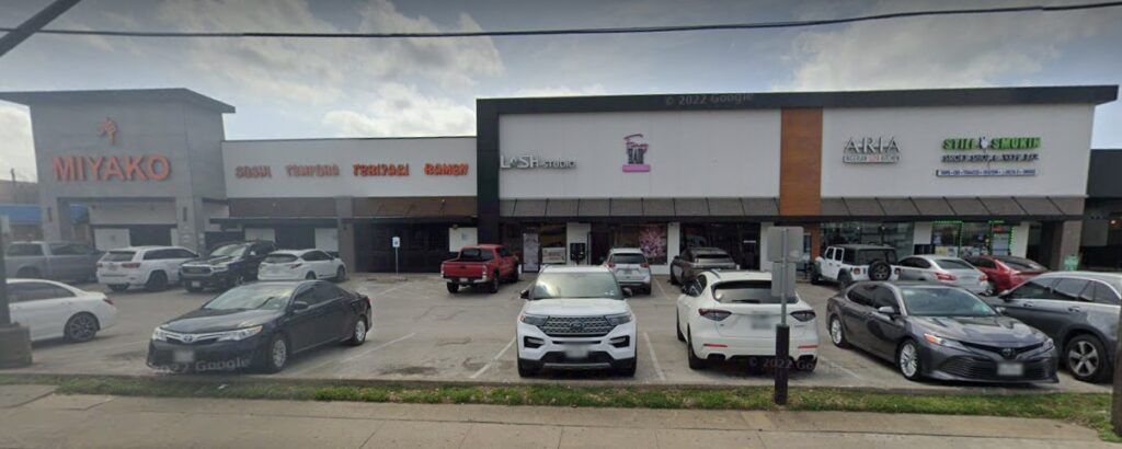
- Refrain from a design being too horizontal or too vertical where it can’t be viable for all uses. I saw a physical location for a store recently, on a very busy street in Houston with lots of traffic, and the logo design was SO bad that I cannot even tell you what the store was from the road. And I should have been able to. It was also vertical in a spot that obviously needed a horizontal.
- All elements of the design can be reproduced in color, greyscale, and black and white. Designers that tend to use Canva and similar programs seem to like putting in gradients and washes – or backgrounds that extend past the logo – that can’t be translated to these other required uses. So you have to redesign to get it to work.
- Lines (including text) that aren’t too thin – these have troubles being reproduced by commercial printers because of color separations and trapping, and can’t be used for something like embroidery on staff shirts for example.
- Multiple file types including PNG with fully transparent background, JPG, vector, possibly SVG and WEBP if needed. And not simply converted, but optimized for each use.
- Helping you make sure that it won’t violate trademark or copyright held by someone else. Keep in mind all financial liability for that will usually be 100% on you as the business owner. But you also don’t want to even accidentally look like someone else – your branding needs to be as unique as you are.
There’s a LOT that we put into designing a logo before we even start drafting the first design. You can have a peek at just a small portion of this behind the scenes of our logo design process. And that video doesn’t even touch upon many of the other technicalities I’ve discussed.
So, in short … start with anything. I recommend though that if you are paying someone to design a logo, you make sure the can explain the things above and meet those standards, otherwise you’ll end up paying a LOT more later, which just isn’t good use of your budget. You’re much better off making your own free logo now – even if it’s not great – versus paying someone who can’t meet those requirements.
Or, of course, hire a professional that can. We can provide a quote for logo design and branding packages. Or, if you need a different design style, we can recommend someone who works in that genre.
Vicky
Here’s a couple of examples for you:
I’ve been designing logos for decades, for business of all sizes – including big multi-million-dollar (and billion) corporations.
This is an example of a logo that has stood the test of time. I designed the Independent Bank (Texas) logo about 20 years ago. They had other variations for different uses. The commercial usage needs have not changed since then.
This is an example of a logo that has stood the test of time – at least until maybe they get bought out and change their name.
This was actually their bank location in Houston.


Alternately, here’s a logo I did NOT do, and an example of poor execution.
See in this strip center, how most of the logos are horizontal, and designed to be read from the road (a requirement of a brick and mortar location).
Notice one is very different. It’s very vertical, which is poor use of space. This makes it VERY small, and I’ve drive past this at least once a week and couldn’t tell you what the location is (except now zooming in to the photo). This is someone who doesn’t have enough business/commercial logo design experience to understand some of the specific needs of their clients. This entrepreneur is going to find out that this logo – which they likely paid for – isn’t going to work well, and end up having to pay for a redesign. Ugh.
Have a marketing question?
Click the chat bubble icon bottom right of the website and ask your question
– OR –
Leave a comment in the “Reply” section down below

Vicky is the CEO and Chief Creative Strategist of Vicky Wu Marketing. She draws from 30 years of experience at the CMO level, the CEO level, marketing for Fortune 500 companies and multi-million and multi-billion-dollar organizations, PLUS strategies learned helping startups and nonprofits with limited budgets … now focusing on providing SMBs with effective and efficient marketing strategies – giving them access to the same level of expertise as the really big guys with deep pockets, that they may not otherwise be able to access.


