VWM-horizontal-2

Website Portfolio

Website Redesign Before & After

Scroll through these images to see before and after screenshots of some of our recent website redesigns.  Keep in mind, these redesigns also all include the addition of increased website functionality behind the scenes, which isn’t directly reflected in the before/after images.
 

The end look of a redesign takes into account many factors – what our client wants their website to look like (because in the end they need to be happy), current best practices so that it functions and converts as well as possible, cohesion with their brand design and voice, and other considerations such as adding function of ecommerce capability or other possibilities.

The Karas Team Real Estate

Joanie and Chris are a husband and wife real estate team that was using their broker-provided website. While it wasn’t poorly designed and included basic functionality, their ability to customize, personalize, and have full control over the contents was severely limited – which is common. We moved them to a self-hosted solution, complete with IDX property search feed, that had the appearance and functionality that they desired, with an updated and upscale design – plus plenty of room for future updates and growth.

BEFORE

AFTER

Our Divorce

Upon doing a review of OurDivorce’s website as part of an overall marketing plan and strategy, I made initial recommendations (to help give you insight to my holistic approach):

  • Softer, empathetic – feel less techie. To the audience this isn’t a tech company. They need to feel like the company understands their concerns to feel like they can trust you.
  • More images of people. People connect to people, especially when they are going through such an emotionally charged situation. Humans choose based upon emotions first, and then back up their choice with data to justify their decision. That emotion needs to be front and center while still balancing the technology … not for technology’s sake (feature) but for the benefits it provides.
  • More diversity – the only photos are of a white couple, and a middle-aged one at that. Hero needs to include image of people to connect emotionally before connecting logically. 
  • Verbiage needs to change, especially in the hero section. Quick focus group composed of the target audience said they don’t trust the statement that divorce is ever easy, and if they start out by lacking trust you’ve already potentially lost them.
  • The first couple photo feels angry and confrontational; one of the first things the audience sees, needs to reflect the benefit / the end transformation instead of how they may start angry. If we’ve started with less trust due to the text in the hero, adding an unhappy image could solidify that lack of trust.
  • CTA buttons need to be significantly more visible and contrast. Not in the same color family. Red and yellow are the two most effective colors for click-through. It’s not visible enough with blue and white since it blends into everything else.
  • Benefits to the audience needs to be higher on the page, directly addressing their pain points and fears.
  • Connecting to audience at earlier stage in user journey – such as an email signup etc., so that we can connect to and market to them until they are ready. If their only option on the site is starting the divorce process, that can feel intimidating, and if they aren’t there yet, they may not come back / or will forget later when they are ready.
  • Needs to speak to biggest fears – financial, child custody and support, losing control, how the audience overcomes those fears, the transformation.

BEFORE

AFTER

Semper Fi Home Inspections

Semper Fi Home Inspections wanted to update and give a more modern look to their website, plus add features such as easy booking online, enhancing their blog, and automatic posting of blog to both their social media and feeding to their email distribution list.

BEFORE

AFTER

Midco Electric

Midco Electric needed an update to their website, with the option to add e-commerce back into the website in the near future as a second setup step.  They wanted a website that would feature the culture of their company, be easy for even their non-technical staff to update, plus provide opportunity for future expansion when they’re ready to add e-commerce.

BEFORE

AFTER

Judge Fite Insurance

Judge Fite Insurance needed a more modern web presence plus additional functionality.

BEFORE

AFTER

MicroType

MicroType had built out their basic website, but needed a slight bit of redesign to match their visual branding and visual appeal.

BEFORE

AFTER

AFTER

AFTER

Spirit 'N More

Spirit N More prints custom apparel for schools, teams and businesses, primarily in the DFW area. All ordering was being done manually through their Facebook page plus in person, and they needed a full-blown eCommerce website capable of capturing orders from anywhere in the US; plus a redesign to match their new logo and color scheme.

BEFORE

AFTER

Power of WOW

This one was a landing page redesign. Lynn had a long landing page for her biggest program which was looking rather dated and not using some of the latest best practices for conversions. The page, and all of the additional pages connected to the funnel, such as upsells and cross-sells, were updated.

LANDING PAGE, BEFORE

LANDING PAGE, AFTER

Conscious Change


The website had been done by the entrepreneur herself, who was not a web designer, and didn’t reflect her very colorful personality (which matches how she offers counseling) plus offered only limited functionality. She was focused on having the deep purple and jewel colors on a black background, personally selected each image to use and was thrilled with the results. 

We also updated her “one sheet” to coordinate closer to the updated website design.

Note Suzanne enjoys working on her website, and the design has likely changed several times since our upgrade. Part of how we are different is that we set things up so that the entrepreneur does have full control over future changes and updates, and provide video training on how to make some of those updates themselves … it’s never beneficial to be chained to a company that has to make even the smallest updates for you.

BEFORE

AFTER

DIY Website Options

These businesses had very little budget to spend on a website because they had just opened their business, but wanted a very basic page to start their online presence.  

The biggest expense for this group of websites is the domain name annual fee, which can vary but for most of these is around $20/year.  

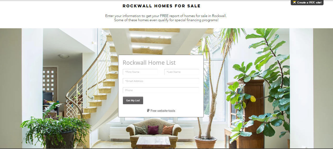
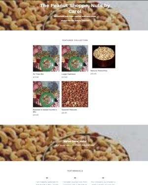
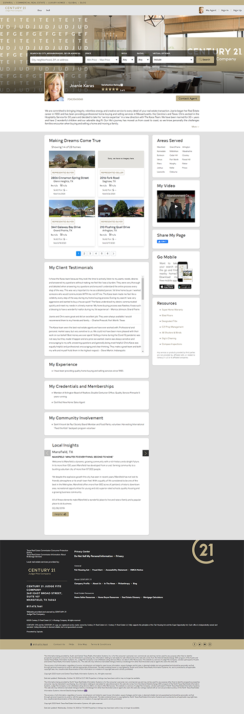
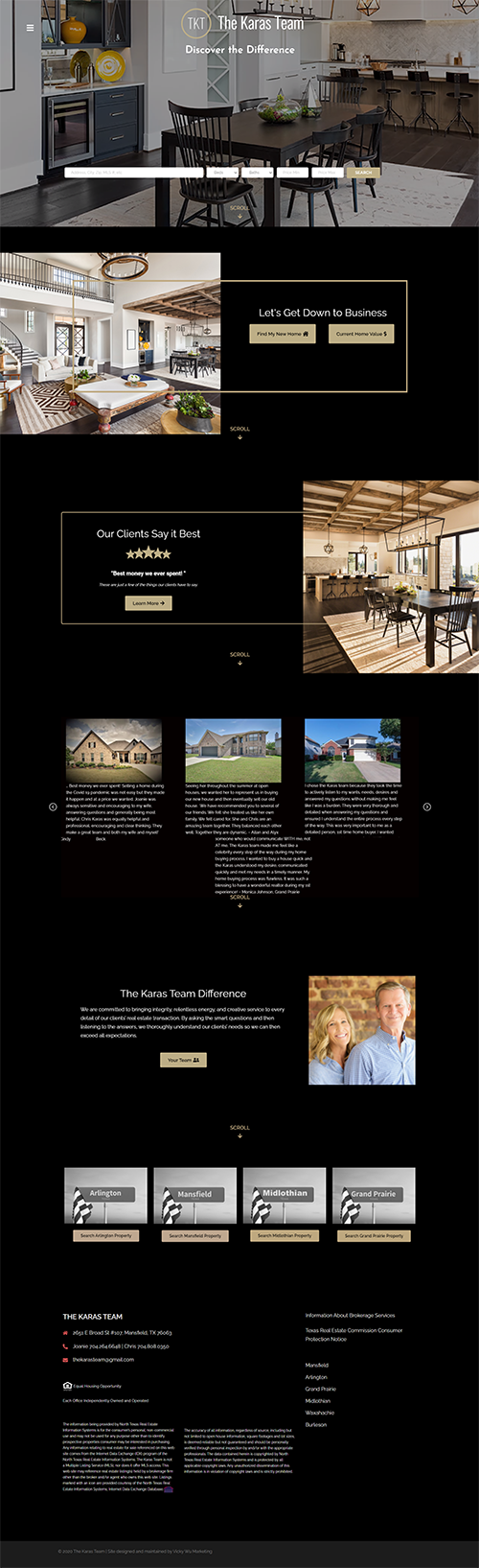
While this is never the first option we recommend, it can be a good beginning choice to get an initial online presence for businesses who otherwise have no website budget available.

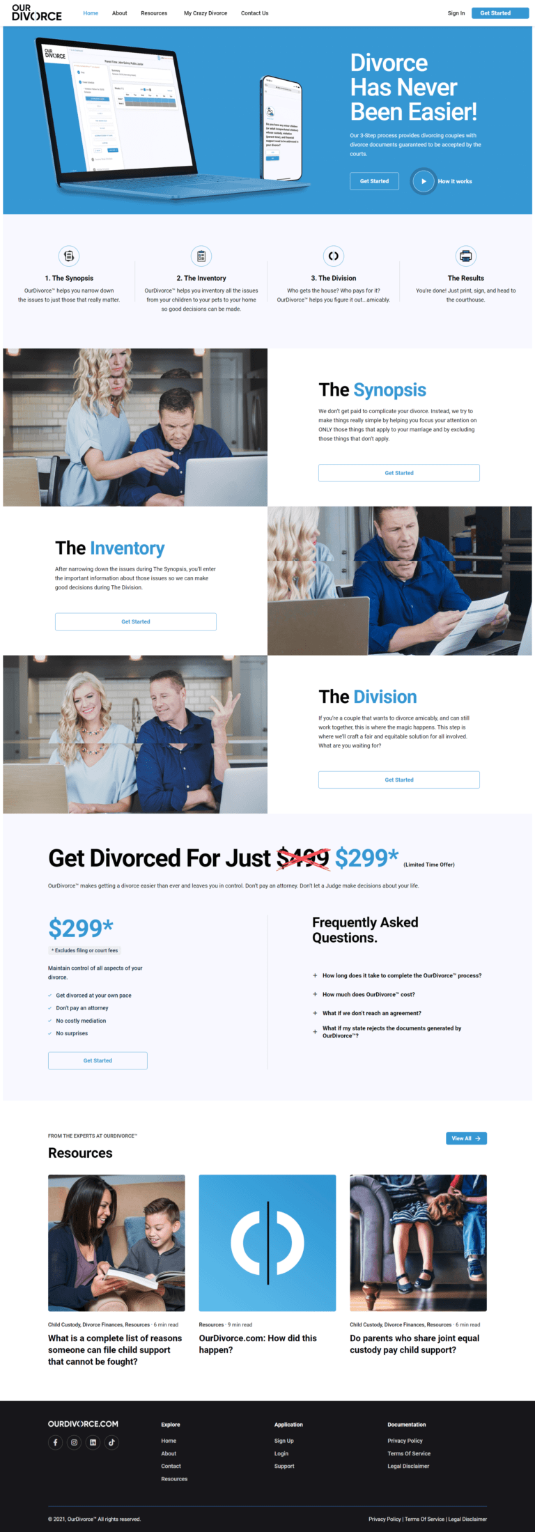
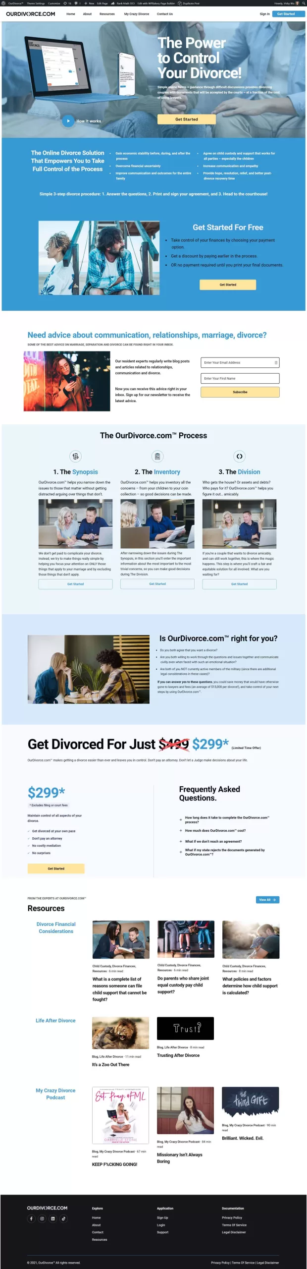
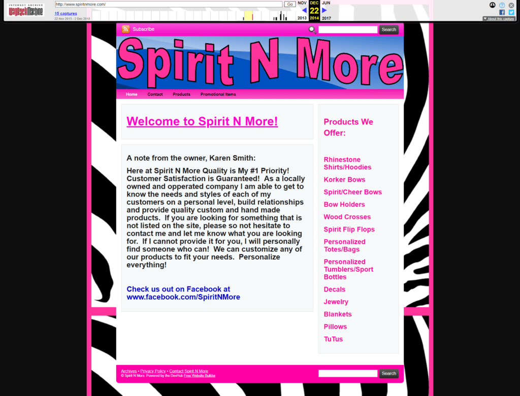
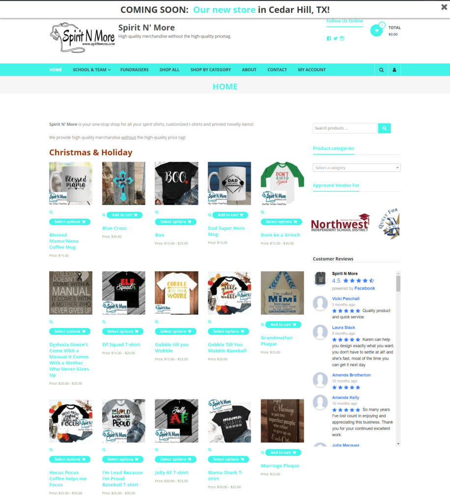
Since we ALWAYS recommend that every business have a website that they maintain full control over, this can also be a great DIY option until you have the budget to pay for a well-optimized, professional website, and hopefully these screenshots will help inspire you if that’s your current journey.

New Release!

Pivot to Success:

Transforming Marketing Missteps into Milestones