- +1 512-591-8295
- [email protected]
- Mon - Fri: 9:00 - 16:00
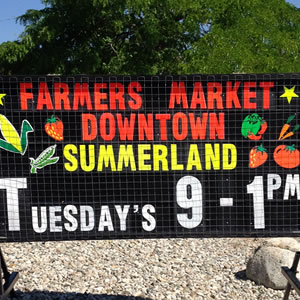
I have to admit, I am not a fan of those free-standing black signs with fluorescent letters that have cropped up everywhere. You know the ones I mean:

I counted as I drove home last night, and there were no less than seven of these signs in a three-block drive down the street!
BUT!
Let me tell you why they work. Because you’re
GETTING YOUR NAME IN FRONT OF PEOPLE.
When I first moved to the area, I had no idea this salon/spa (or whatever it is) even existed. As I drive down the road, their building, and hence whatever sign on their building, is perpendicular to me in my car; so sometimes it’s behind me. I don’t look over that far. Plus, the building is removed from the road a bit, past the grass and parking area, way over there —> while my eyes are (or should be) usually directed in front ^.
Then, shortly after I started noticing the breeding of these signs (like rabbits!), I saw one in this spot advertising massages. Massages are great and always sound great, but I wasn’t in need of one. But I now knew where to find one if I did. Before, all I knew is that there was a street with some buildings with architecture that could be business or home. And frankly, I didn’t care – nothing I needed was there, I never turned and drove down the street … it didn’t impact me.
And then about a week ago I caught the sign again out of the corner of my eye. It mentioned up-dos for prom and WEDDINGS. Guess who has a wedding soon? And even though I plan on doing my own hair, this place is now permanently marked in my brain.
So even though I STILL dislike these signs, it really brings home the importance of
GETTING YOUR NAME IN FRONT OF PEOPLE.
Customers can’t use your service or buy your product if they don’t even know you exist!
Consistency in marketing is critical. By simply having their name in front of people, consistently, you are vastly increasing awareness. It ties back to the very simple concept that one of our regional managers used to increase the real estate business in the office where I used to work – put out yard signs, but then also put out OTHER signs directing people to the “new listing” … and do so consistently.
And notice all the way through this article – we did not once touch on LinkedIn, Google, Facebook, Pinterest, iPads, tablets, or anything else that can also bring good results. We touched on a very fundamental piece of marketing – consistently getting your name in front of people. And these (ugly!) signs accomplish that, especially for business that cater to locals.
I’m not saying go out and rent or buy these signs. I’m saying look back at your fundamentals – how often and how consistently are you getting your name in front of potential customers?
(side note: visited the website of the salon shown above, with the thought that I would message them and let them know they were getting a bit of free, if albeit ODD, advertising. Then I saw their wedding hair specials. Hmmm….! See how that name recognition works? https://www.allyjanesalon.com)
Get solid marketing strategies, designed for entrepreneurs on the track to 7-figures and beyond, right in your inbox.

This website uses cookies to ensure you get the best experience on our website. By continuing to use the website, you agree to our use of cookies. We do not share or sell your information. More info
