It used to be that only Pantone released a “color of the year”. Now a few other major color players do, as well. But what do they mean?
I’m curious – are you seeing any of these colors lately?
I remember when I worked in marketing for retail (I did marketing for malls), I could walk through a mall at the start of any fashion season and tell you exactly what economic outlook was expected for that industry. Dark, drab colors meant that they were expecting dismal sales. Bright, cheerful colors meant they expected a great financial season.
I often wondered if instead of the colors reflecting what economy they expected to be in, instead those drab colors drove fewer people to purchase. I never did have a definitive answer on that, and nowadays the fashion “seasons” are almost a thing of the past with the speed that new clothing designs are brought to market.
But color trends reflecting (or impacting) the bigger economy aren’t a new concept. A 2012 article in ApartmentTherapy discusses just that according to the author Bethany Seawright “The colors of the seventies were pretty drab in comparison to those of the psychedelic sixties. The country was recovering from the turmoil of the Vietnam War, and the desire for peace and calm was reflected in the dark wood and warm earth tones of the period.”
Psychology does tell us that colors can be a big driver for purchasing habits. But don’t run out and change your brand colors! That’s a different animal altogether.
The color of the year simply reflects the one(s) that are expected to be most popular based upon trends of the prior year.
I tend to still pay the most attention to Pantone in my industry, and I always recommend interior designers pay attention to ones from the paint companies since they have hard data as to recent purchase trends.
Knowing popular colors can be helpful for things such as your social media, since these colors can drive or be part of current trends, you may want to include them in your short-term marketing efforts.
Pantone has actually chose two colors for 2021 – Ultimate Gray and Illuminating – and they are complementary and will look great together. While having the more muted gray, Pantone is one of the few that has a very bright color in their choices this year. Most of the other companies, especially the paint companies, are choosing more muted and “comfortable” color options.

Graham and Brown, which choose both a color and a wallpaper pattern, probably has one of the richest colors in their choice of Epoch.

Sherwin-Williams has chosen Urbane Bronze for 2021.

Benjamin Moore has chosen Aegean Teal as it’s color of the year, complemented by a full color trends palette chosen for 2021.
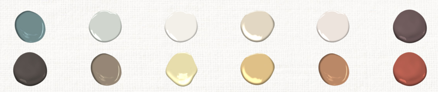
BEHR paint actually has chosen 21 colors for 2021 (I see what you did there). They work well on their own or combined in multiple ways. Since it’s a full palette, I’ll let them share it with you:

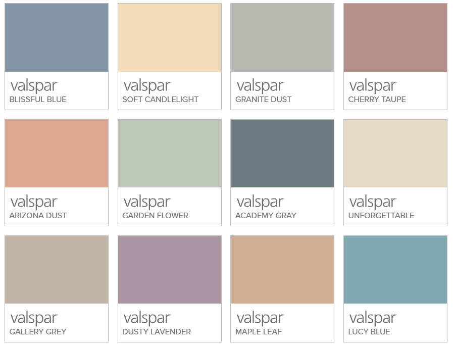
Valspar, another paint producer, similary has chosen multiple colors for 2021 – 12 of them:
Rustoleum is another with a more vibrant color, yet it’s still muted and warm in it’s Satin Paprika.

What do I see in these trends above?
Other than Pantone’s choice of yellow, the colors are muted and lean towards warmer versions even when cool. That this would be a reflection of 2020 isn’t surprising since it was a year that had a lot of uncertainty and turmoil, and cozy, warm inviting colors make sense for 2021.
What are your thoughts?

Vicky is the CEO and Chief Creative Strategist of Vicky Wu Marketing. She draws from 30 years of experience at the CMO level, the CEO level, marketing for Fortune 500 companies and multi-million and multi-billion-dollar organizations, PLUS strategies learned helping startups and nonprofits with limited budgets … now focusing on providing SMBs with effective and efficient marketing strategies – giving them access to the same level of expertise as the really big guys with deep pockets, that they may not otherwise be able to access.